Brand Strategy
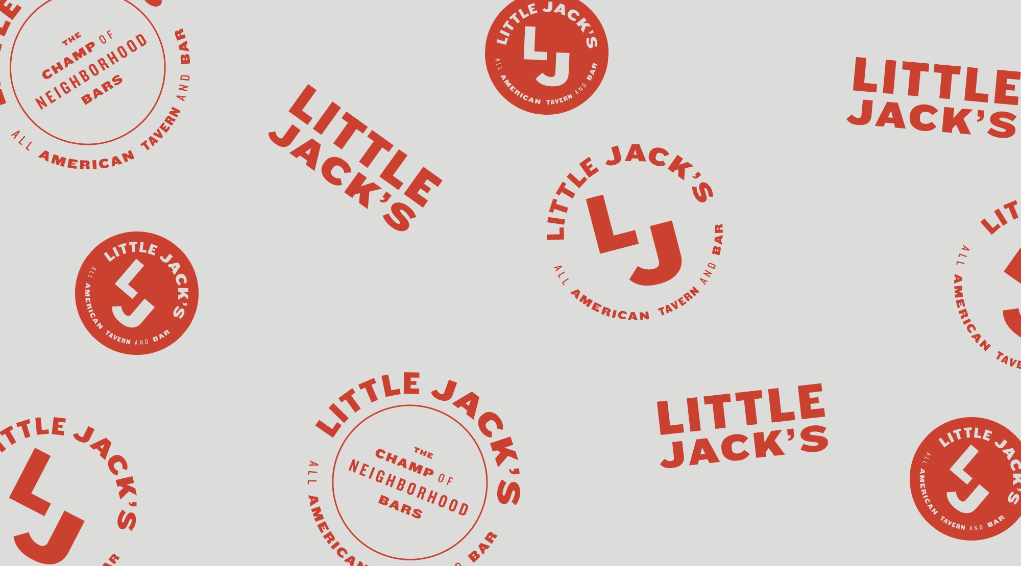
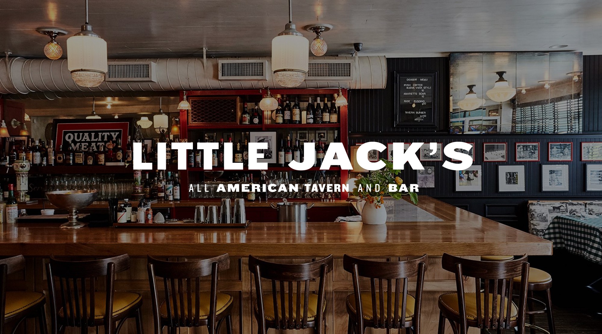
Little Jack's Tavern wanted a brand identity that felt instantly iconic and dripping in nostalgia. Drawing inspiration from boxing, horse racing, and classic American machismo, I developed a visual identity designed to feel familiar from day one, as if the tavern had always been part of Charleston’s landscape.
Visual Language
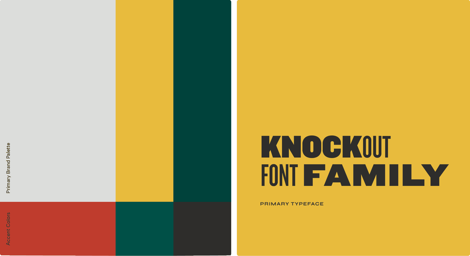
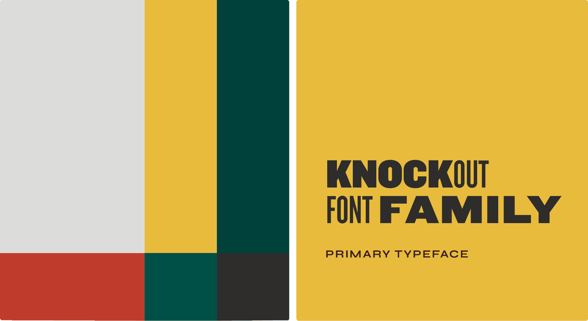
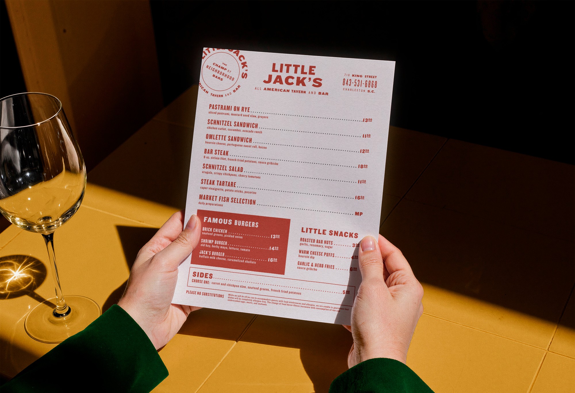
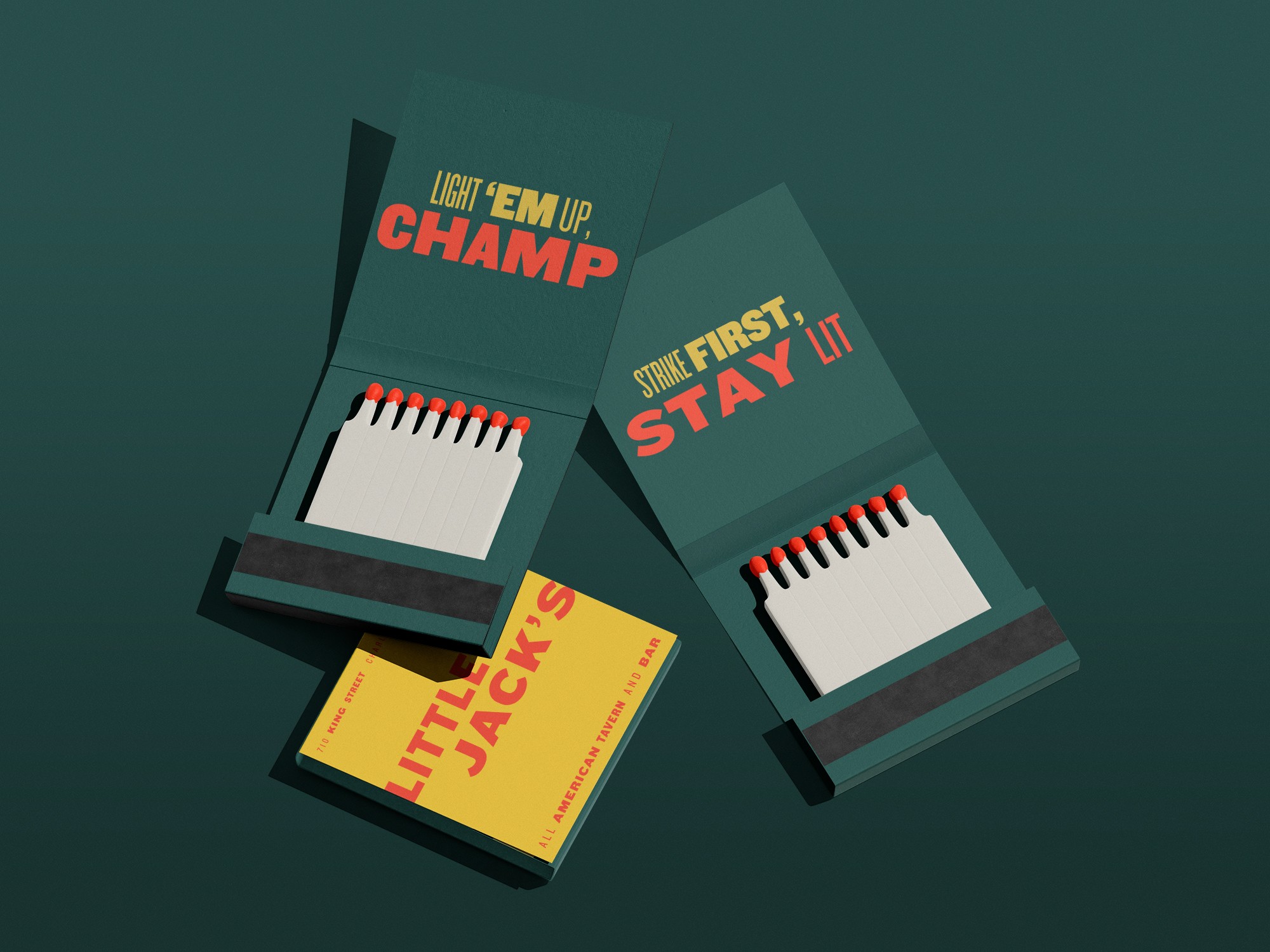
Typography became the foundation of the system, with the Knockout font family serving as both a visual and conceptual reference to boxing weight classes. By layering different weights and styles, I created a handcrafted aesthetic inspired by vintage letterpress printing. The resulting identity feels bold, worn-in, and yet still very approachable, balancing intentional design with the character of a long-standing neighborhood tavern.
Results
The final identity gave Little Jack's a distinct and memorable visual presence that reflects the spirit of the space itself. The branding suite helped launch Little Jack’s into the beloved Charleston institution it is today and positioned it as a true stalwart of the city’s dining culture.

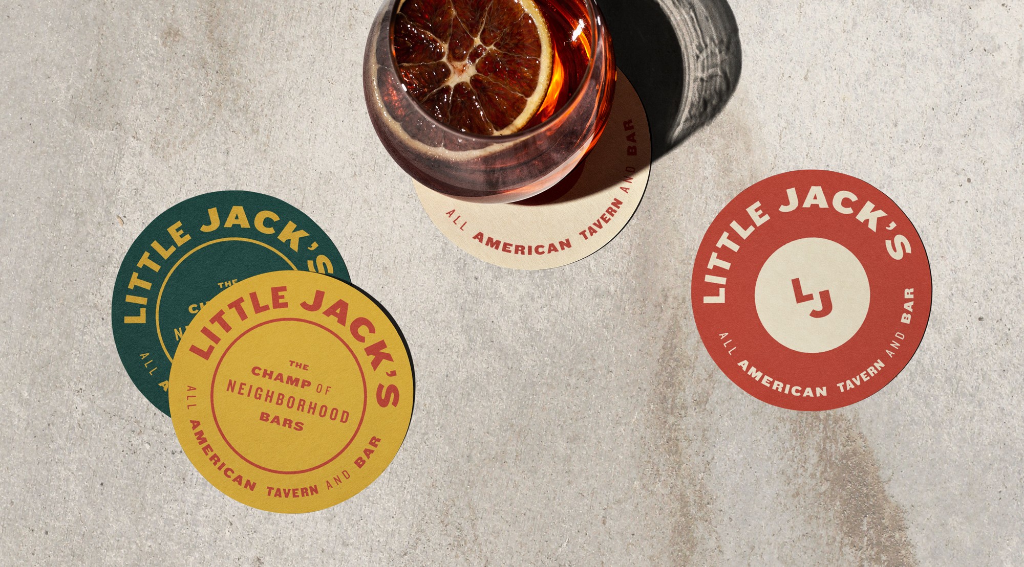

The brand’s color palette carried seamlessly into the interior and exterior design, creating an environment that felt fully cohesive with the visual identity.